Product design
Pulse
A personal finance app redesigned so the next action is always obvious within one glance.
- Client
- Pulse
- Year
- 2025
- Role
- Product design
- Services
- UX, UI, design system
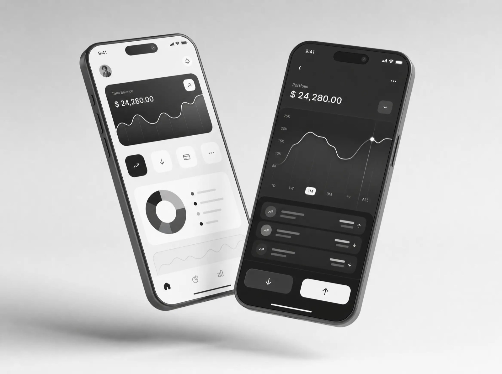
Pulse helps freelancers smooth out irregular income. The app had the right model and the wrong surface: thirteen screens where four would do, and charts that demanded interpretation instead of offering answers.
Design for the glance
We rebuilt the information architecture around a single question — can I spend this? — and made the answer the first thing on screen. Everything else became progressive detail: tap for the month, tap again for the ledger.
The component system is strict: one number scale, two chart forms, and a fixed vocabulary of states. Dark surfaces keep the numbers in front.
The result
Task success in usability testing went from 54% to 91%, and week-two retention rose by a third after launch.